Dashboards
Versatile Dashboards
Our Dashboards are versatile, completely customisable and can show any aspect of your Internet traffic in a variety of formats. Customers can drill down into their Dashboard for granular and detailed info.
Below are demo’s of a just a few of the dashboard options available to LucidView Guardian, Netflow and Enforcer Customers.
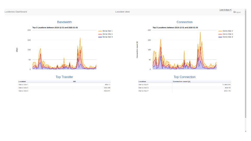
Click on the image above to see a demo of a consolidated overview of different sites, departments or even profiles.
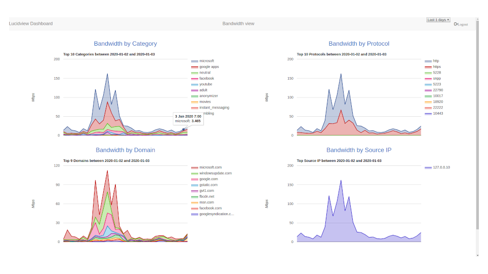
Click on the image above to view how bandwidth can viewed, in this demo it is you can see Categories, Domains and Protocols.
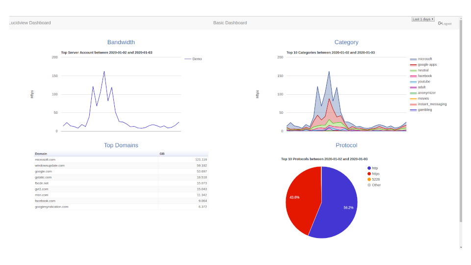
Click on the image above to view a Basic Dashboard Demo, in this instance the top users, categories and domains are included.
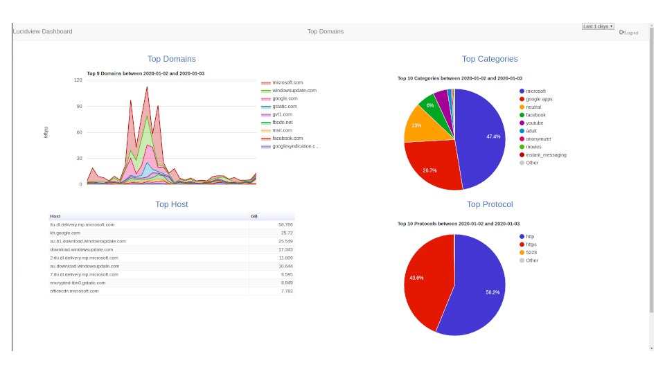
The image above shows a more detailed demo of the top bandwidth users, in this example both domains and hosts are included alongside categories and protocols.
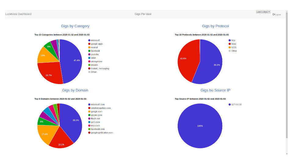
Pie charts are a useful way to present complex data, click on the image on the left, here we have chosen to represent the amount bandwidth used in a variety of ways including by category, protocol and domain.